Jacob Thornton and Mark Otto realized the need to have a standardized framework as well as some tools for development when Twitter started to expand. The decision lead them to the formation of toolkit with HTML and CSS known as Bootstrap (earlier known as Twitter Bootstrap). This eased the development process to a great extent. Now a number of websites like MSNBC and NASA are making use of this framework. It is present on GitHub and is one of the most sorted out open source projects.
The most important step that you need to take to convert an image design in PSD to responsive HTML, is to write styles in CSS. This will decide the responsiveness of the site. To write the code in CSS you will get help from Bootstrap. This overall means that the responsiveness of the website depends on the CSS code.
So now a questions pops up in the mind. What is this Bootstrap and how we make use of it? Simply, Bootstrap consists of a collection of HTML/CSS templates and a number of tools which you can make use of while developing the website. Now with the latest version of Bootstrap 2.0, you can build responsive website as it supports responsive web development. You can develop any type of website with Bootstrap. You can even use it with different CMS, which allows integration with custom CSS like Drupal, Joomla, WordPress, etc. Again, when it comes to this framework, one of its outstanding features is that it supports different web browsers like Internet Explorer, Firefox, Chrome, etc.
What do you Mean by a Responsive Website?
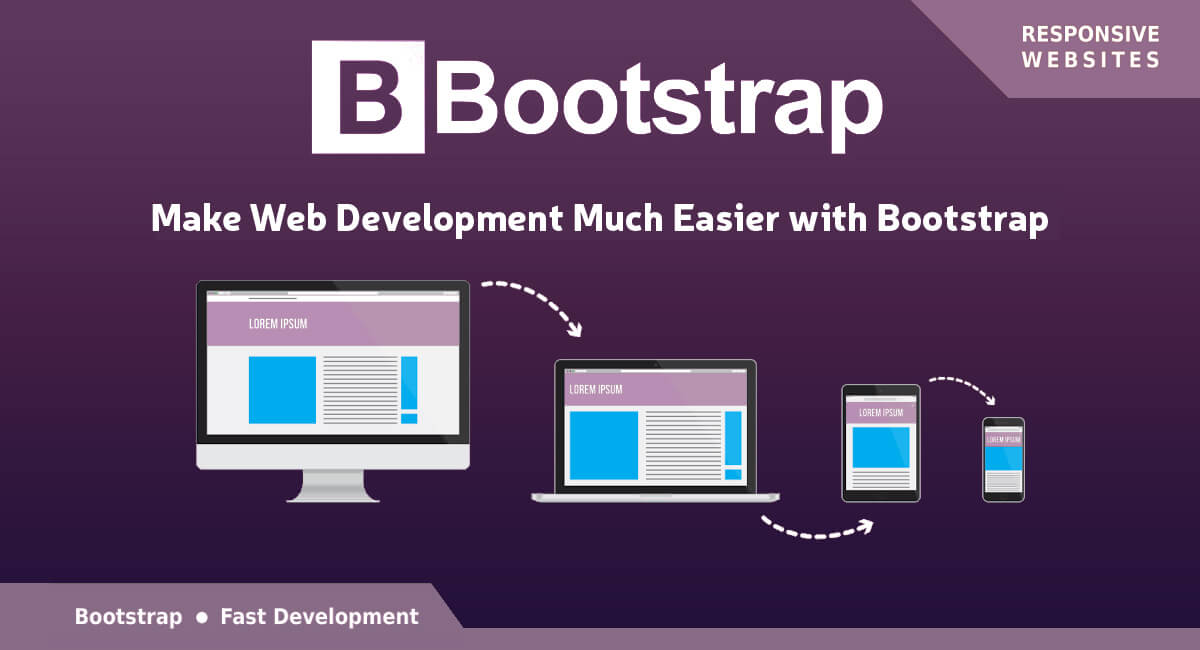
A responsive website is one which you can view on different screen sizes without compromising on the optimal viewing experience. Here optimal viewing means a user can view all the contents of website even on a small screen device without doing much scrolling and even gets to view all the contents like image, text and others properly. This means a website with optimal viewing feature will arrange and adjust itself automatically according to the screen size.
How such Websites are Developed?
Generally two important techniques are followed to develop websites that are mobile compatible. One of these two techniques is to create a separate domain for the mobile website like xyz.com/mobile or m.xyz.com and get the traffic directly on that domain. It is true that this way you will get an optimized version of your site, but it comes with a number of disadvantages too. For example, you may face the problems of promoting two different domains for the same store, duplicate content as well as dilution of links.
Another technique is to create the website by making use of CSS styles so as to have responsive website with different versions that fits according to different screen sizes. Media Queries will help you detect the size of the screen. The only disadvantage that comes with this technique is that the old browsers does not support the new versions of CSS. This makes it difficult to display the sites with such CSS styles. This issue has been solved to a large extent as people keep on changing to the newer browser versions.
Developer’s Work Simplified with Bootstrap
Now developers can easily create different websites by making use of pre-built CSS framework from Bootstrap. It comes with a number of tools which the developers can easily use from the HTML of the website. All the important HTML components like page headers, pills, thumbnails, accordion, alerts, button dropdowns, navbar, modals, button groups, carousel, progress bars, lists, labels and typeheads have been defined with a basic style by Bootstrap.
Bootstrap is based on the dynamic style sheet language – LESS which is regarded as a CSS extension. LESS is comparatively faster than other extensions like SASS. Moreover, LESS is based on JavaScript, which is well-versed by developers, making it easy for them to understand.
Even though, most of the professional developers go their way to create custom code, many prefer the CSS files of Bootstrap to develop their websites. The only issue with Bootstrap is that the framework is not fully built on CSS3 and does not completely support HTML5. This happens because only the latest browsers supports CSS3 and HTML5 technologies and most of the web users are working on the lower browser versions. So to make the website work everywhere, you have to compromise somewhere.
Getting Started with Bootstrap
Before we get started with Bootstrap, understand one thing that it is not possible to get the maximum out of the framework unless and until you have the complete knowledge of HTML and CSS. Many believe that it is quite easy to learn the technologies in just 3-4 months. But it is not quite true. You can follow some of the tutorials on the internet to learn CSS and HTML.
You need to download the compiled version from http://twitter.github.com/bootstrap/index.html to start with Bootstrap. You can easily customize the framework using this site. You can start working on this compiled version automatically. It does not come with the source code. If you want to download the source code, just visit https://github.com/twitter/bootstrap/zipball/master. Just make sure to compile the file before using it.
Extract the zip file in a folder after downloading it. Now you need to initialize the Bootstrap. You have to do it in the head section as well as in body section having JavaScript.
<head>
<meta name=”viewport” content=”width=device-width, initial-scale=1.0″>
<link href=”css/bootstrap.min.css” rel=”stylesheet” media=”screen”>
…
</head>
<body>
<script src=”http://code.jquery.com/jquery.js”></script>
<script src=”js/bootstrap.min.js”></script>
…
</body>
Understand that there is no need to call JavaScript as most of the things would work without it. Still some functions such as dropdown menus and alert need animations and functions styled using JavaScript.
Bootstrap Grid
There are 12 grids in Bootstrap and you can find them as fluid and fixed grids. The fixed grids use pixels through column width on the other hand, fluid grids measure relative length in percentage.
In order to make the website responsive, fluid grid is used by Bootstrap which changes the column width in the grid and adjusts the text and heading accordingly. Image sizes are also resized using fluid grid as it is measured in percentages. You have to use stack instead of float elements to make the website responsive.
Bootstrap and JavaScript
There comes JavaScript files along with Bootstrap that supports a number of components as well as extends its abilities on the Bootstrap framework. The best thing is that all the plugins are available in a single file and you don’t have to write a single line of code to access them. The simple API mark will help you access them. Some of the Bootstrap features that make use of JavaScript are buttons, collapse, modal, affix, dropdowns, carousel, tab, alerts, tooltip, popover, scrollspy, typehead and transitions.
Conclusion: For all the programmers out there looking for ways to create a responsive website, Bootstrap is just for you. It is true that there are other responsive frameworks too, but Bootstrap is an open source project which is constantly evolving. This means you will be able to get complete support of this framework on CSS3 and HTML5 in the future.