There is nothing more important than being ready for today and tomorrow. Many websites are still not ready for yesterday. Certainly, we are talking about how prepared companies and websites are towards mobile technologies.
Use of mobile phones and tablets is increasing
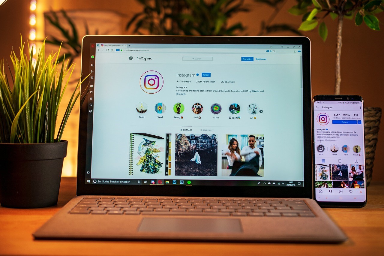
Mobile phones and tablets are being used in an astounding volume. Much of the Internet traffic arrives from tablets like iPads and smartphones like iPhones. This suggests that people will now need to concentrate on different screen sizes when designing websites. It is no more enough to design a website for a large browser and assume people will be able to watch it and use it well.
Websites should be optimized for mobile devices
When people arrive at websites from a mobile device, they will get annoyed when they see a website that is not optimized for smartphones or tablets. This means, they may just move on to the next available website in order to find something that is optimized for mobile devices. With that in mind, here are some precautions that we must take while designing for mobile devices:
1. All mobile devices are not the same
2. Tablets, smartphones and even models have all got different screen sizes
3. It is not possible to design different websites for different screen sizes
4. Websites should be optimized for all screen sizes
5. We cannot predict the screen sizes of different models that will be released in future
With this in mind, it is important to ensure that we follow certain web technologies that are designed for mobile devices. Responsive web design is one such web technology that helps web designers to design websites that are optimized for mobile devices. These websites automatically change their screen sizes and adjust to the device screen depending on which device a user is using.
Fluid layouts and adaptability make responsive web design one of the most important web design technologies at the moment. It is not clear however how long it takes for people to adapt to responsive web design s many companies are still using old websites that do not belong in 2013. Let us try to understand some of the advantages of responsive web design:
Holistic solution
Responsive web design offers a holistic solution to the problems posed by mobile devices. It allows designers at any web design firm to design websites that are optimized for full screen browsers on computers, tablets and on mobile phones.
Affordability
Responsive web design is not as expensive as it is made to be. A good web designer can design great responsive websites for mobile devices
Timelessness
Responsive technology is timeless. A person will be able to make minor changes to websites and make it applicable even after a few years.
With all these factors in mind, we must note that responsive web design is a very important web design technology and will continue to remain so. There are many great training courses out there that will help older web designers to refresh their design skills so that they are relevant even today.
Author Bio: Clara Cummings is a responsive web designer at a web design firm. She stresses on the importance of designing websites with mobile devices in mind.