When it comes to image manipulation and editing, Adobe Photoshop is one of the most powerful and advanced tools there is. With a variety of tools and settings its possibilities are virtually endless and Adobe Photoshop remains a favorite for the majority of graphic designers and artists worldwide.
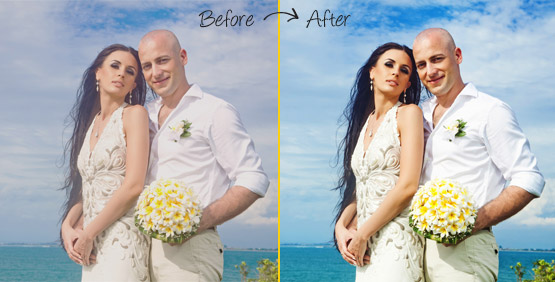
One of the essential techniques used in both heavy photo manipulation and soft retouches is color correction. Color correction is not only used to make inserted objects look like a natural part of the composition, but it can also be used to set the general ”vibe” of the image or make low-quality pictures more clear and saturated.
Coming up next are the 4 most commonly used color correction techniques in Adobe Photoshop.
Levels
To select the levels editor simply navigate through Image>Adjustments>Levels. This will bring up the levels window which will allow you to manually set the output levels of RGB colors in your image. This technique is perhaps the easiest of the four because of the intuitive interface of the levels editor. It can be used to increase or decrease contrast in the image or raise or lower the presence of a certain color in your document. The levels window works by using the sliders under the graph preview in the center of the window. For the purpose of this article, let’s say we want to increase the warmth of our picture. We will do this by opening the levels editor and selecting Red from the channel drop down menu (this menu is located beneath the ‘presets’ menu). Then, we will take the center slider and move it to the left until we’re satisfied with the increased ‘redness’ of our image. Moving the slider to the right has the opposite effect, and thus would make the image blue-shifted. Brightness can be adjusted by selecting ”RGB” from the channel drop down menu and moving the center slider left or right.

Hue/Saturation
The hue saturation menu is the easiest way to manipulate the saturation level of any image. You can enter the Hue/Saturation menu by navigating Image>Adjustments>Hue/Saturation, or by using the keyboard shortcut Ctrl+U. In the Hue/Saturation window, you are presented by 3 sliders, Hue, Saturation, and lighting. By manipulating the Hue slider you essentially change the output color of hues in the base image. For an example, when the slider is set to default, all reds are presented as reds, but with the slider set to 50 all reds will take on a yellow hue. The Hue slider can be used for making small adjustments in the overall hue of the image or making the image slightly colder or warmer. Beneath the Hue slider is the Saturation slider, with it, you can change the general output levels of all colors in your image. Moving it to the far left will disable any hue output making the image appear monochromatic. While moving it to the far right will amplify any colors in the image. The saturation slider is useful for setting the overall tone of the image, and reducing the saturation of the image can reduce the amount of color noise present. The lowest slider is the Lighting slider, this one will only change the lighting levels outputted by your image. Moving it to the left will make the image darker and vice versa.
Curves Editor
This technique is a bit trickier to master but is nevertheless pretty powerful. Navigate to the curves editor by selecting Images>Adjustments>Curves, or by using the keyboard shortcut Ctrl+M. This editor is somewhat similar to the Levels editor, you are greeted with a graph and a curve above it. The graph represents the base color values and intensity of your image, while the curve represents how are those values outputted. Moving the curve to the top left will make the output level of our selected channel higher, and moving it to the lower right will make it darker. Let’s once again for the sake of example assume that we want to give our image a bit more warmth. We will do this by selecting Red from the channel drop down menu, and manipulating the curve by moving it slightly to the top left.
Color Correction using the Selective Color menu.
Selective Color
It’s one of the more advanced ways to manipulate colors inside a Photoshop document. Open the Selective Color menu by navigating Image>Adjustments>Selective Color. The Selective Color menu is used to change the color amounts ”inside” other colors, essentially enabling you to digitally mix colors. Let me explain in more detail how does the Selective Color menu work. The color selected in the color menu gives you the choice of which color you want to manipulate, while the slider menu beneath lets you choose how you want to manipulate it. Moving any of the sliders will change how the slider color is outputted in the color selected above. Let’s say we’ve selected Blue in the color menu, moving the Magenta slider beneath to the left will increase how much Magenta is present in Blue hues of our image. Difficult to master this is one of the most powerful color correction technique available in Photoshop with very precise and effective results.
In conclusion, these are very different techniques that produce essentially the same result. We recommend that you check every one of them and see which one fits you the best.
For details about Product photo retouching, editing, cleaning visit our website page.